Do you have a room in your house that makes you cringe when you walk in? Perhaps you are like me, about 3.5 years ago when we moved into our current house. Built in 2000, the house had a modern open layout with every room oversized (sadly, except the kitchen) but poorly decorated. And by poorly I mean it was decorated by someone who thrived in 1992 but had not moved past that date.
My wall color in the living room and bathroom was a peachy keen color, my kitchen a mint green covered with sunflowers. Room by room, we renovated our house with easy touch-ups including flooring and paint. Each reveal made our house more attractive (and of course added value to it as well!) After going hard our first spring and summer in the house we officially threw in the towel and declared it DONE. The thing is, it wasn’t really done. There were several things I had wanted to change but – you know how it goes – life gets busy and you end up tolerating things rather than loving them.
I have to share my main bathroom with you all, and the transformation it has gone through to get to where it is today. I present to you – the main bathroom. A room with a double shower and jet tub, oddly laid out and horrifically decorated when we moved in in 2010:
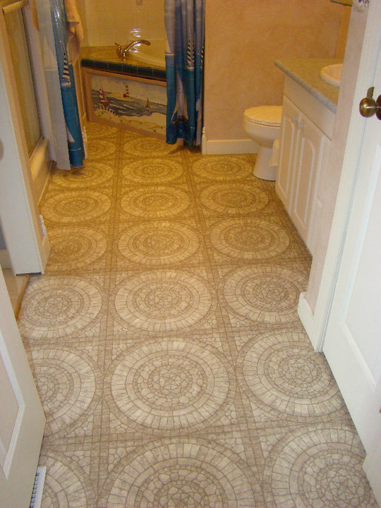
Yes that is a linolium flooring made to look and feel like the texture of cobblestone. We’re in Mexico! No, wait, we’re on the East coast with sailboats!
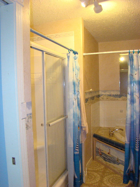
Why yes there are shower curtains in front of the sliding shower doors and in front of the jet tub – should two people want to bathe at the same time you don’t have to look at each other’s nakedness (how often did that happen, do you think?)
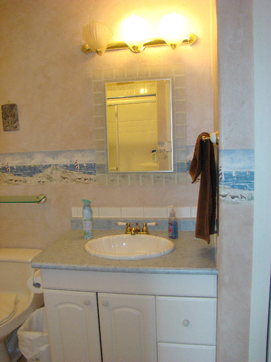
A seashell toilet seat, sink and vanity lighting. I know you’re jealous. If you put your ear to the toilet do you think you’d hear the ocean?
And then, the reno AFTER! New flooring, new vanity and lighting, and new paint. What a difference that made!
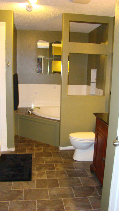
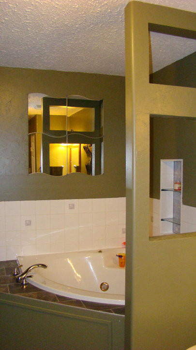
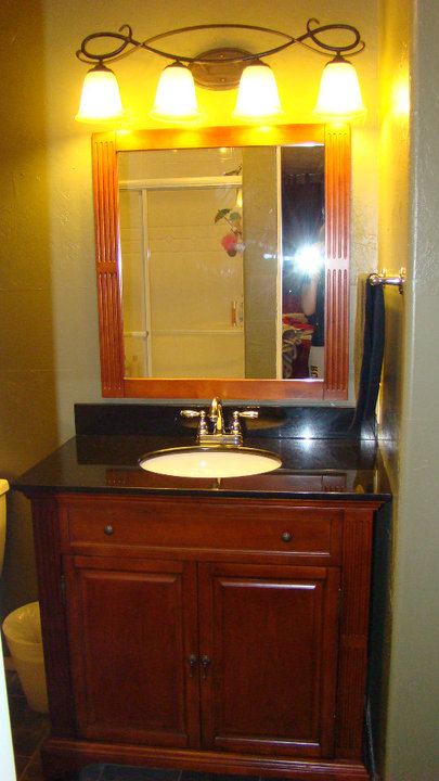
Looks amazing right? There’s one thing that is still there from the original bathroom. Yes, the big jet tub of course, but check out the tiles. Go ahead, I’ll wait here…
Same white square tiles! Urgh! It was the one thing that got left when we renovated the room and it has stayed the same for over 3 years now!
It’s not awful, but it doesn’t flow with the room at all. It’s outdated. It has little pictures of cobblestones in it. And it reminds me of the bathroom the way it looked that first day we walked in! It’s been a long overdue makeover.
Thanks to the amazing people at Home Depot, my bathroom is going to finally be complete! Home Depot has teamed up with Feisty Frugal & Fabulous for #TileFabulous, a bathroom tile makeover that will take this bathroom from 2000 tile to modern tile ready for 2014! We’ll be pulling off the old, outdated tile from the tub surround and shower area and replacing them with gorgeous glass tile!
My husband, a handyman extraordinaire, is going to take on this challenge himself. I’m the artistic director and photographer, as usual. I might even bring him a coffee from time to time.
I’m so excited to see how we can take this bathroom from old-style 2000 tile to #TileFabulous in November! Are you ready? Stay tuned to my Instagram and Twitter accounts where I’ll be sharing updates on our makeover project and of course back on the blog for the big reveal in a few weeks!





Sailboats on the tub really?
HAND PAINTED on the bottom of the tub surround (wooden panel door to the electrical under the jet tub). Oh yes! I was kind of sad painting over top someone’s art…but I got over it.
wow! it looks so classy now and larger.
What a lot of work but the end result is amazing. The colours you picked are great and I love the floor tiles. Job well done!
WOW! It looks AMAZING! I am totally jealous of how much space you have LOL Our bathroom is so outdated and very tiny! (I mean like closet tiny! LOL)
Wow! It looks awesome! Congrats and enjoy!!!
Love it . Congrats. Enjoy relaxing in that tub
I can’t wait to see the big reveal!
This definitely looks like a Mum’s bath! I hope you have lots of pretty Body Shop stuff. I think everything looks lovely and my favourite colour is green…well done you!
Wow…just Wow. Nice re-do but how did you even live that long in Nantuket?
It was only a matter of a month or so before we put in new flooring and painted, thankfully! The tiles have been the same for 3 years now, can’t wait to change them out and complete this makeover!
I dont get the curtain for privacy when there’s two huge holes in the wall by the toilet lol someone could still see you while you bathe. I think they might of used it to hide the tub? idk interesting set up I always like seeing peoples handy work. The bathroom looks more relaxed now.
It’s odd right? But why on earth would you want to hide a big jet tub?!
Each and everything is looking prefect in your bathroom. Seriously, I am also feeling jealous but also glad to have your tips. I will keep in mind your tips when do my bathroom makeover.
Thanks so much! I can’t wait until it’s complete!